Walk down the coffee aisle at any half-decent grocery store and you can pick out the premium brands without reading a single label. Something about the way the bags sit on the shelf just reads differently darker, more restrained colors, cleaner typography, a certain weight to the packaging that makes the cheaper bags next to it look thin by comparison. That’s not an accident, and it’s not just good taste either. It’s a set of decisions those brands made on purpose, and most smaller coffee businesses never quite catch on to what those decisions actually are.
I’ve talked to a few small roasters over the years who were convinced their coffee was just as good as the big premium names, sometimes better, and they were probably right about the coffee. But sales told a different story. The bag was doing them no favors, and they didn’t fully realize how much weight it was carrying.
They Treat the Package as Part of the Product
Premium coffee brands don’t think of packaging as something that happens after the coffee is roasted and bagged. It’s part of the product from the start. The weight of the bag, the way it seals, the sound it makes when you open it all of that gets tested and considered right alongside the actual roast profile.
This shows up in small details most people don’t consciously notice but absolutely register. A matte finish over a glossy one. A slightly heavier paper stock. A resealable strip that actually works instead of one that tears the bag apart the first time you use it. None of these are expensive add-ons in isolation, but stacked together they create a feeling of quality before anyone’s even tasted the coffee.
Restraint Reads as Confidence
One pattern that shows up again and again with premium coffee packaging is how little it actually says. Cheaper brands tend to cover every inch of the bag with claims bold, rich, smooth, award-winning, single-origin, ethically sourced, and on and on until the whole thing reads like a list of adjectives instead of a coherent brand.
Premium brands say less. A short, specific tasting note. Maybe the origin and nothing else. Plenty of negative space. That restraint isn’t laziness, it’s confidence the packaging design of a brand that assumes the coffee will speak for itself once someone tries it, and doesn’t feel the need to oversell before that happens.
They Match Packaging to How People Actually Drink Coffee
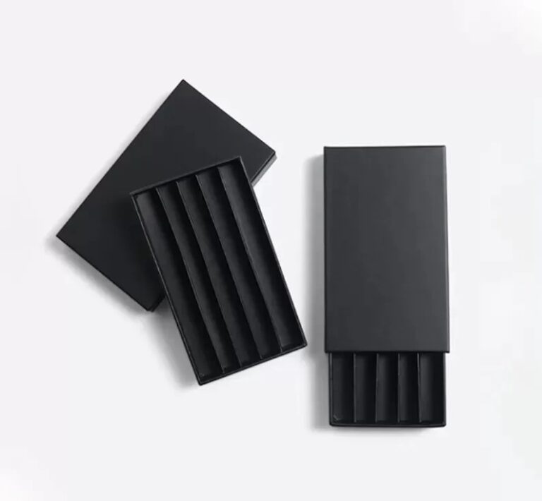
Not everyone brews the same way anymore, and premium brands have adjusted their packaging to reflect that instead of pretending single-origin whole beans are still the only format that matters. Pods and single-serve formats have become a massive part of daily coffee consumption, and the brands doing this well haven’t treated it as a lesser product line. Custom coffee pod boxes designed with the same attention to color, material, and finish as their whole-bean bags let a premium brand carry that identity across every format they sell, instead of the pods feeling like a cheaper, generic afterthought bolted onto a nicer product line.
That consistency matters more than people expect. A customer who buys the premium whole bean bag one week and picks up the pod box the next should recognize it as the same brand instantly, not have to double check.
Freshness Cues Are Part of the Design, Not an Afterthought
Premium coffee brands are usually very deliberate about visible freshness signals a roast date printed clearly rather than buried in tiny font, a one-way valve that actually functions, sometimes even language on the bag explaining why the valve matters. This isn’t just functional packaging engineering, it’s also a trust signal. It tells the customer this brand cares enough about freshness to explain it, which subtly implies the coffee inside is fresher than something sitting in a bag with no visible date at all.
Cheaper brands often skip this, either because it costs slightly more or because nobody on the team thought about it. But it’s one of the lowest-cost ways to build credibility with a customer who’s comparing two bags side by side and doesn’t know either brand yet.
Consistency Across Every Touchpoint
The last thing worth noticing is how consistent premium coffee brands are across every place a customer might encounter them the bag on the shelf, the box it ships in if ordered online, even the cup sleeve if they have a café presence. Same color palette, same typography, same tone. It sounds obvious, but plenty of coffee businesses let this drift over time, especially once they start selling through multiple channels and different packaging gets ordered by different people without anyone checking it against the last batch.
That drift is exactly what breaks the premium feeling. A customer builds trust through repetition, and every inconsistency resets that a little.
The Takeaway for Smaller Roasters
None of this requires a massive rebrand or a huge design budget. It starts with treating packaging as a real decision instead of a logistical afterthought, saying less instead of more on the label, keeping formats consistent across product lines, and making freshness visible instead of assumed. Premium coffee brands didn’t stumble into their presentation by accident. They made deliberate choices, one detail at a time, and those details are exactly what a smaller roaster can start copying without needing the budget of a national brand to pull it off.